Boodafrog
Brand identity, packaging, and textile design for a hard seltzer startup born on the beach.
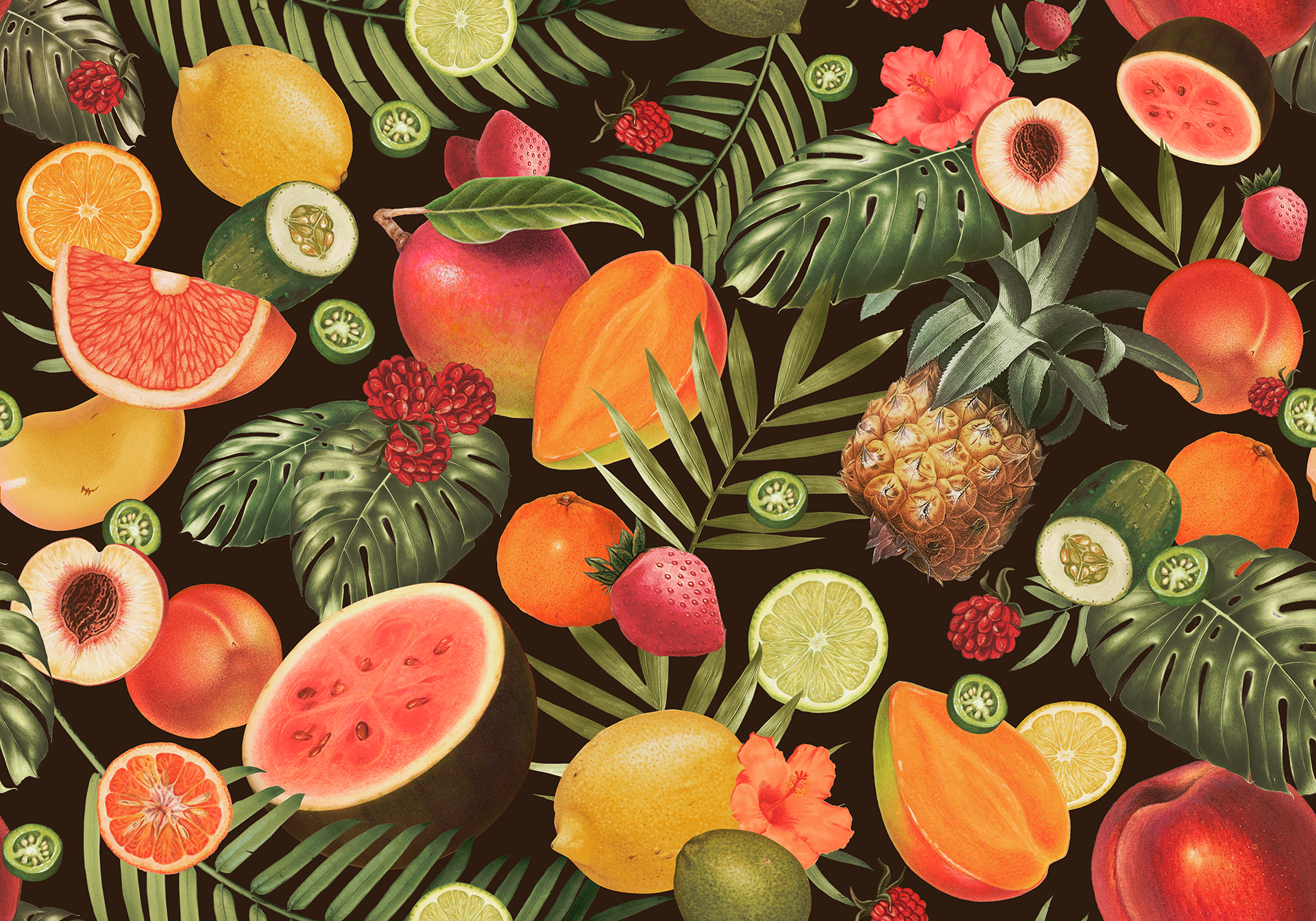
Miami meets manga in a comprehensive suite of assets for upcoming hard seltzer brand, Boodafrog. Its playful anime-styled mascot pairs with muted psychedelic and lush tropical patterns for an identity unlike anything in your store's beverage cooler. Boodafrog isn't afraid to step out of the cooler either, with a lineup of beach-minded apparel and goods that balance trend with character. Lush patterns take inspiration from ingredients found in each flavor, with elements designed to be interchangeable based on season and specialty brew. Project development to date includes visual identity, can and bulk packaging, and surface pattern design for textiles.
Boodafrog is planned to hit shelves in summer 2022.
CLIENT
Boodafrog Hard Seltzer
TYPE
Art Direction
Brand Development
Identity & Logo Design
Packaging
Surface Pattern
TYPE
Gold ADDY – Logo Design [2021]


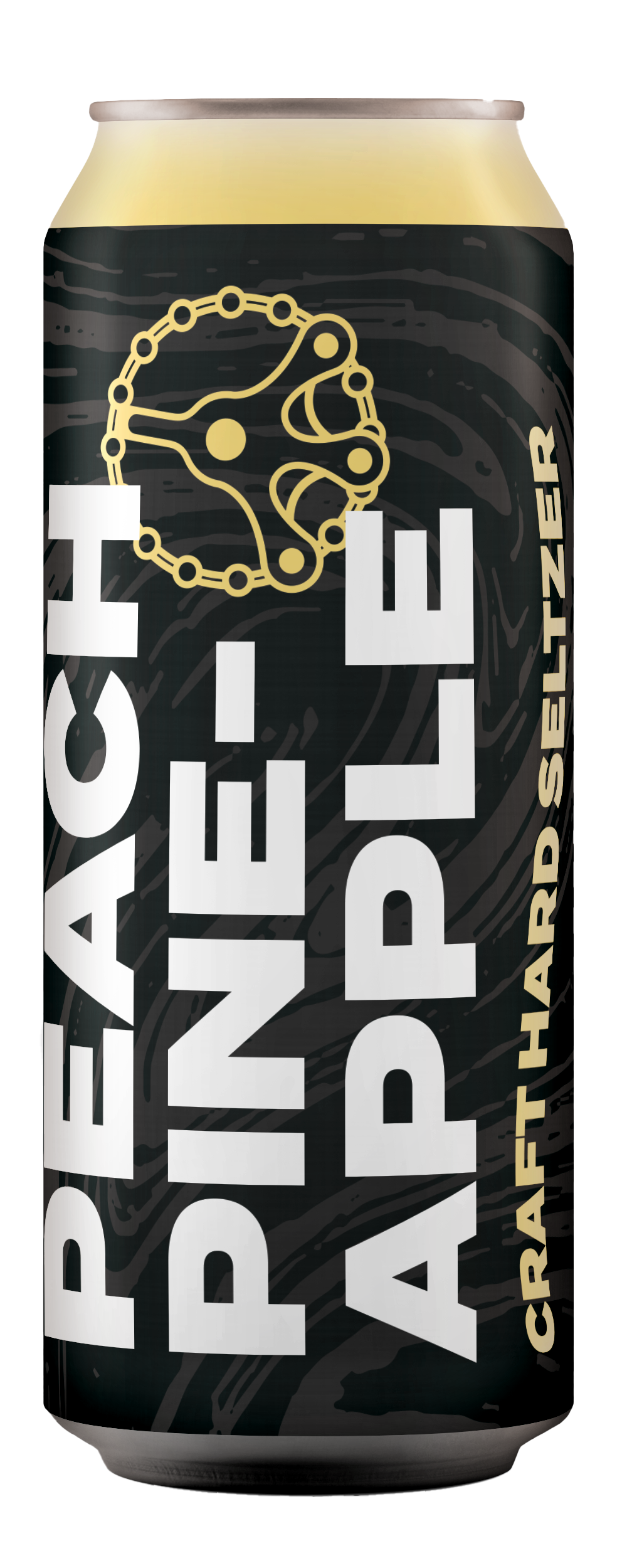
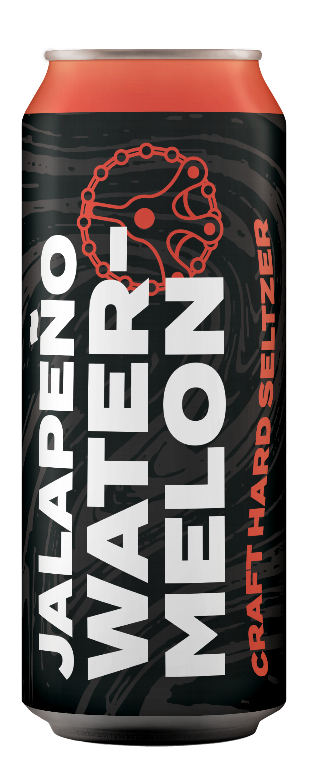
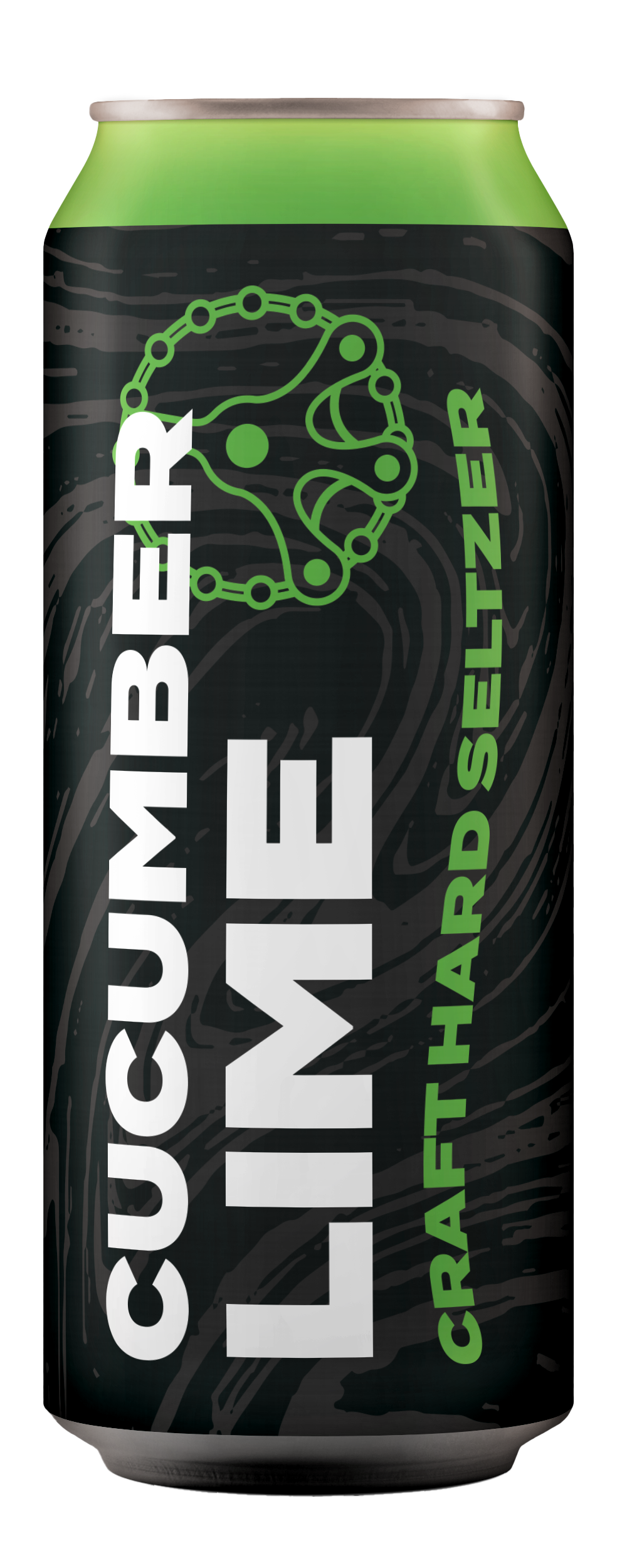
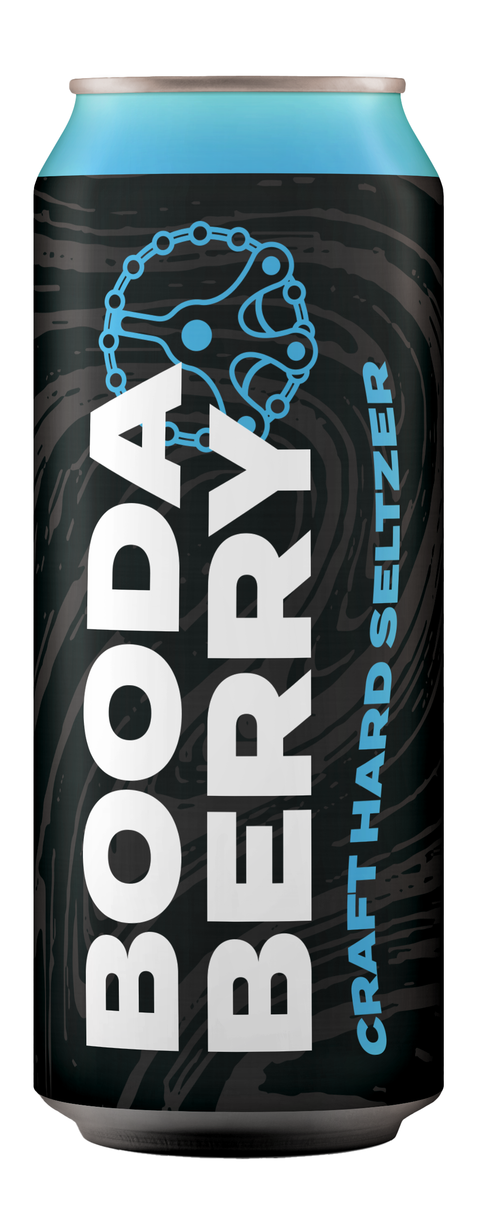
Beyond aesthetic consideration, color serves as an organizational system. Each hue corresponds to a flavor offering within the seltzer lineup and functions as an identifier in retail packaging.
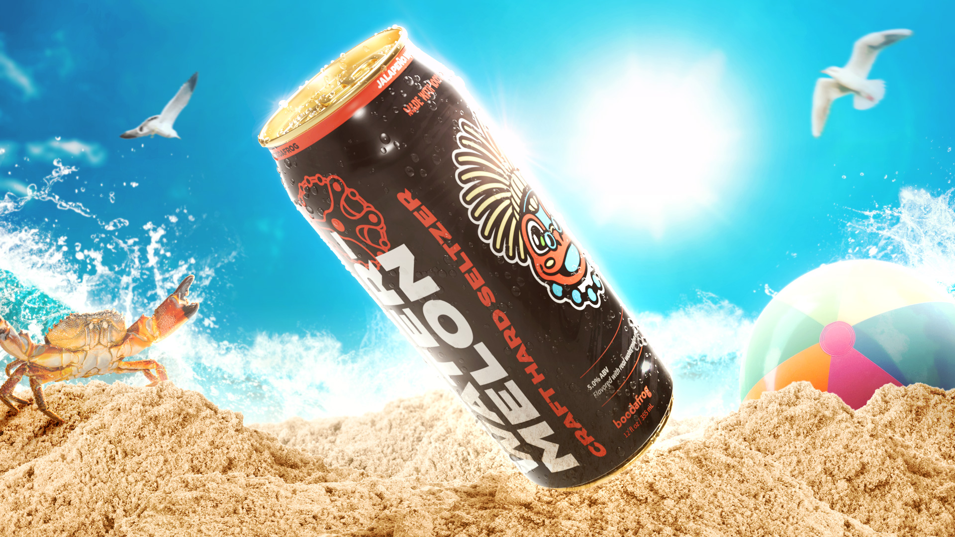
From the onset, Boodafrog's founders had envisioned a black can for their product. In a sea of brightly-colored labels, they wanted to be the outlier – an ideology the project team embraced and elevated through subtle (yet delightfully trippy) pattern work.

© 2022
